I am thinking of changing the title to the colours of the cupcake as it does not seem to fit in.
I am thinking of changing the title to the colours of the cupcake as it does not seem to fit in.
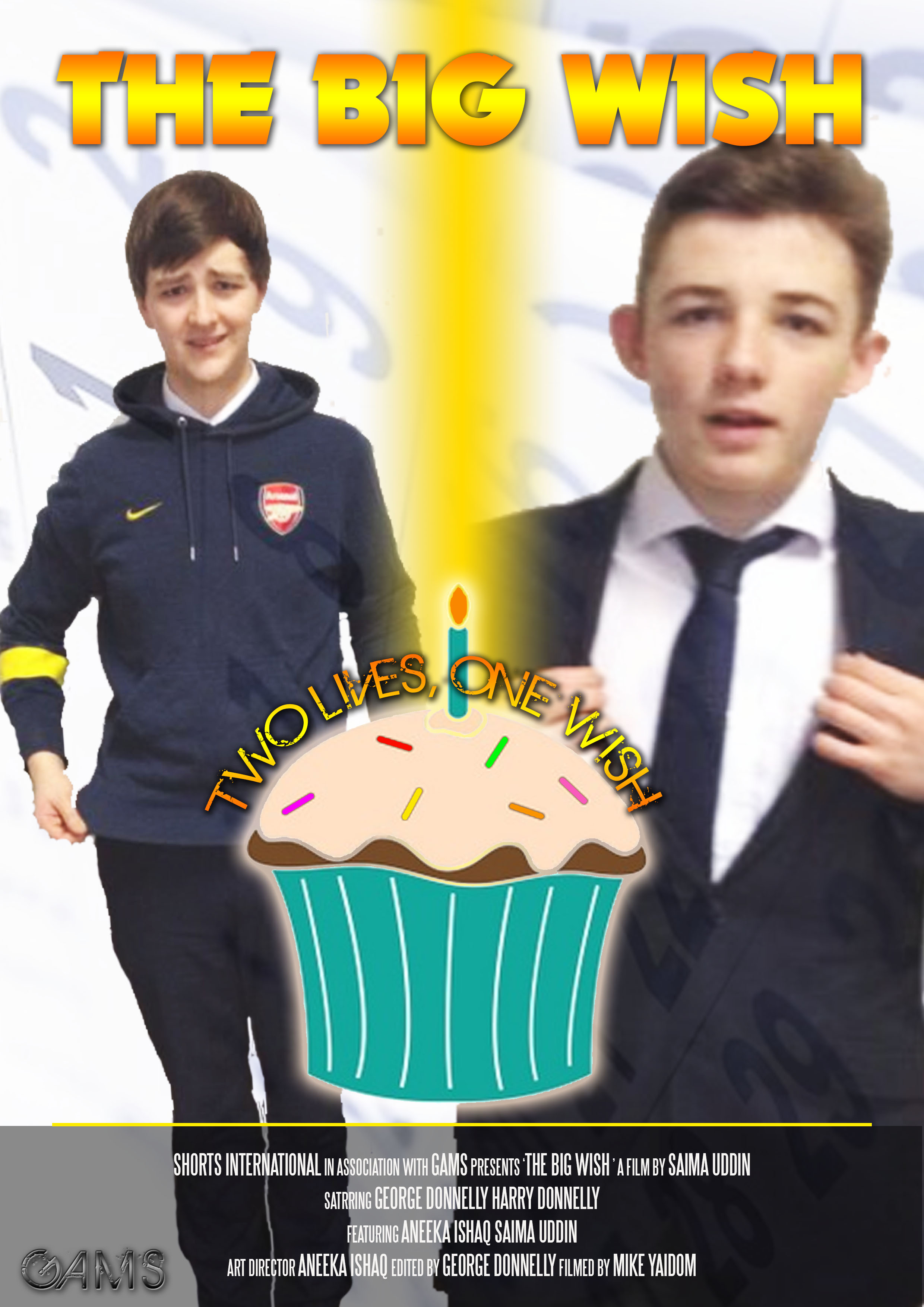
This is what my poster looks like with the white background. After having spoken to the target audience which are teenagers and some adults like my teacher. The majority said that they preferred this one.
I changed the credits to white so you can see them better and put them in the centre in order to fit the conventions for the credit block.
I spoke to my teachers and peers about my poster and here is the feedback I received.
The Title needs to be changed. I thought that this particular title was effective and created enigmas about the film. However majority of the feedback insisted that the title is made similar to other comedy film posters as there is a lot going on with all the different colours.
My original title

Could be used
The credit block also needs to follow more conventions such as being in the middle. As it is on most comedy posters. Also it needs to be changed to white as my background colours are quite dark and you can see it very clearly.
My credit block
Credit block in white
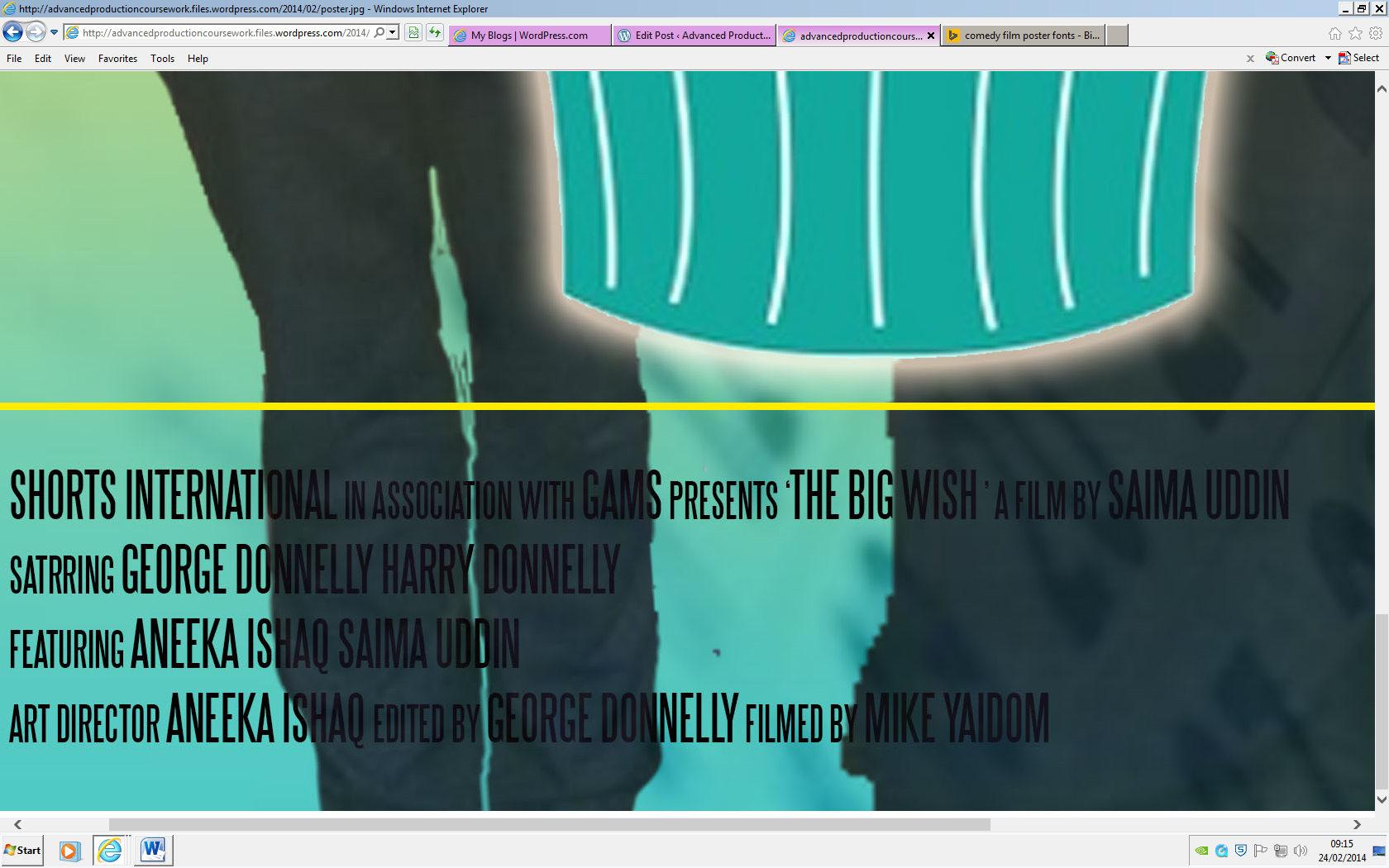
Furthermore I was also asked to make the poster without the blue and white background colours just to see what it would look like.
I personally thought that the cupcake was something that they would disagree with.

The cutting of other character on my poster.
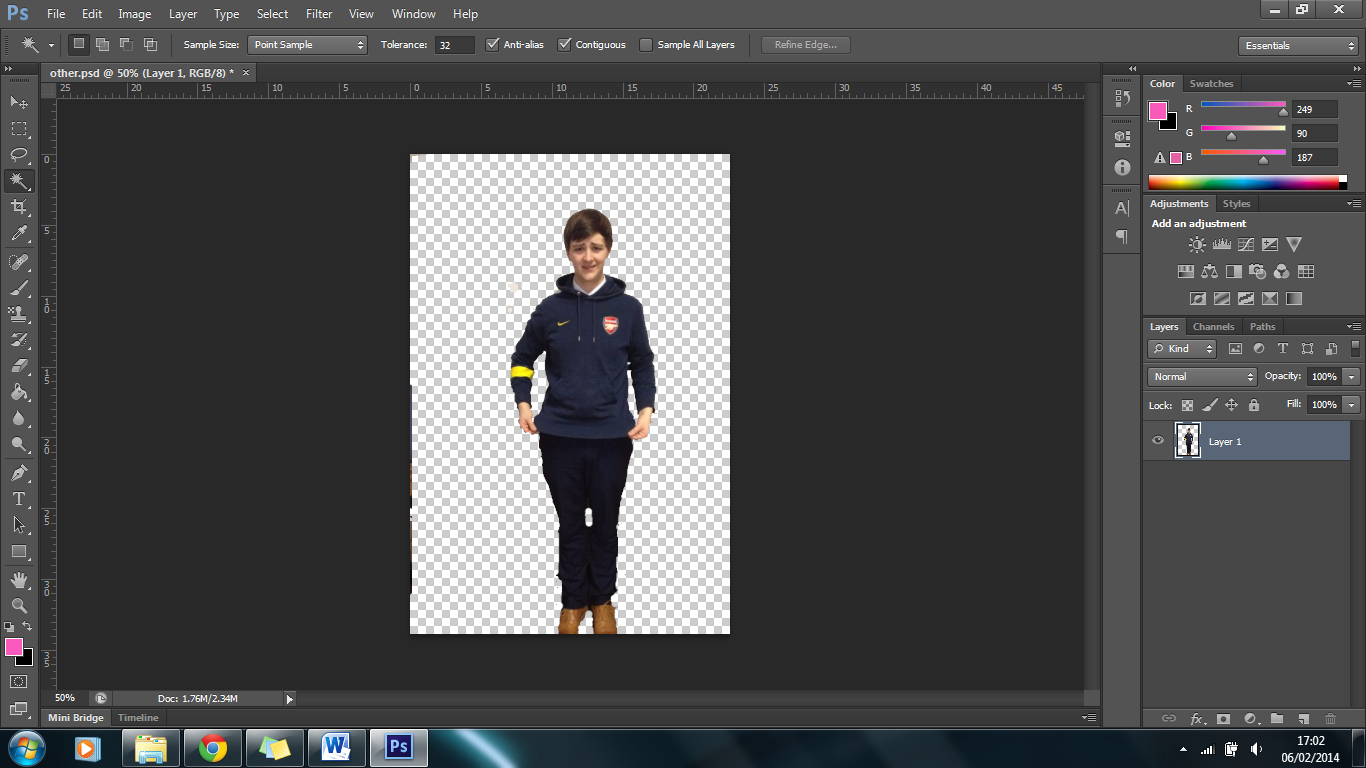
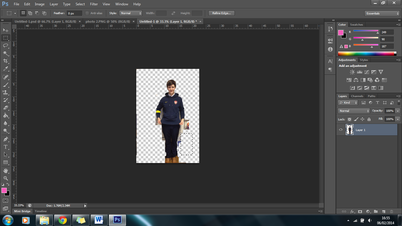
I am still cutting out my characters from the background. On this one the brown shows were the same colour as the floor and this proved difficult to cut out.
I used a photoshop tutorial from youtube in order to cut out the characters for my film poster.
